Somewhere Over the... Sphere? Grading The Wizard of Oz for a New Dimension
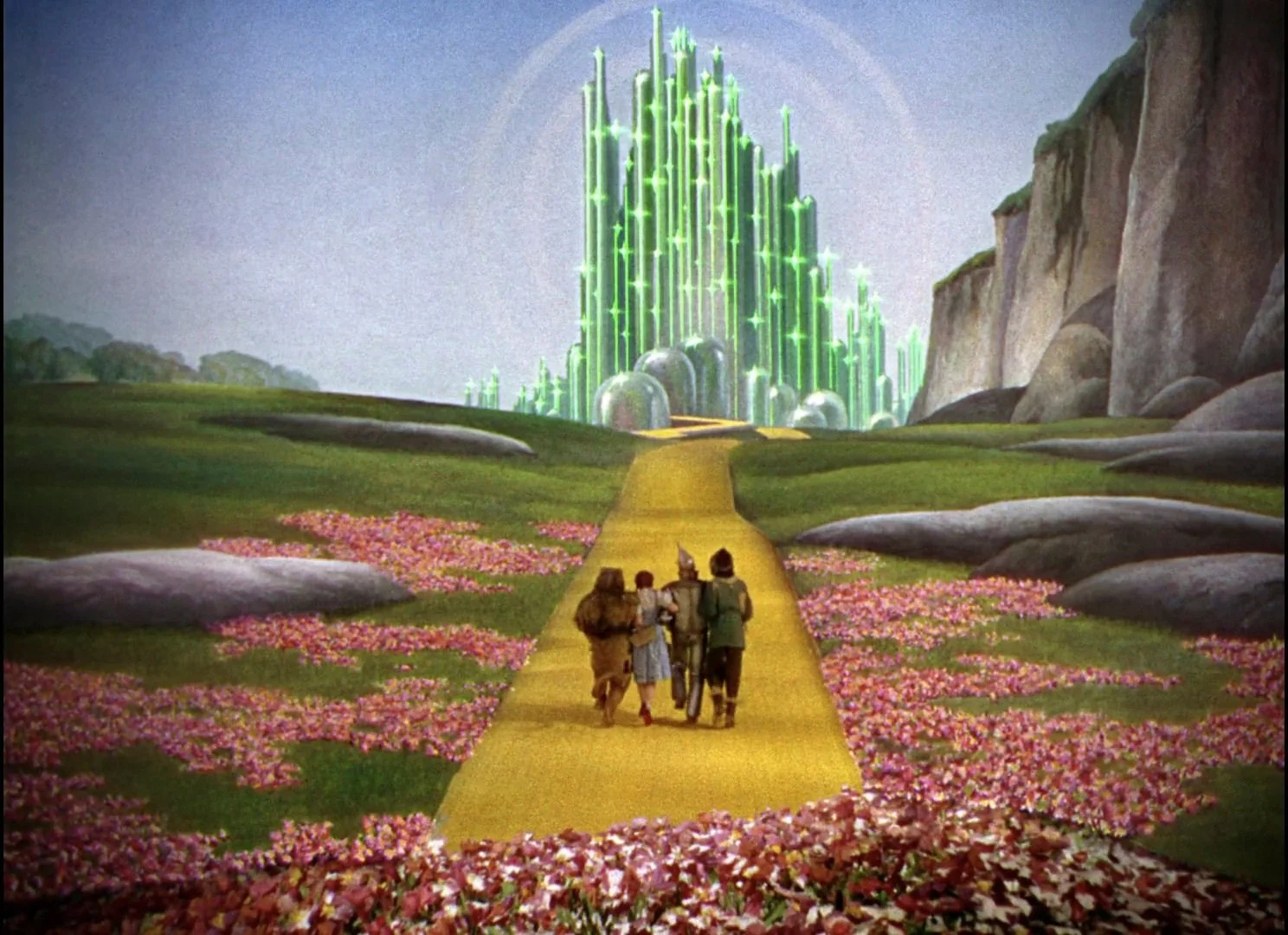
Of all the projects I’ve been a part of, The Wizard of Oz at Sphere is in a category of its own. It’s one thing to grade a film; it’s another to grade an experience that wraps around a 16,000-seat audience on a 16K, 180-degree screen.
This project was a massive undertaking by the entire Water Tower Color team, in collaboration with Sphere Studios, Warner Bros., and Google. But our primary mission wasn't to reinvent the wheel—or in this case, the Yellow Brick Road.
The Mission: Protect the Master
Our main task was to stay 100% true to the definitive 4K remaster completed a few years ago. That master was a beautiful P3 D65, PQ 4000-nit grade. Our challenge was a technical translation: how do you take that reference-quality image and faithfully port it to the Sphere's unique display—a new color space (MSG Primaries) with a 2.6 gamma and a 500-nit peak?
It required building a custom transform, rigorously testing, and ensuring that the artistic integrity of that 4K master was preserved, just on a scale no one had ever worked with before.
The "How": Grading a Sphere
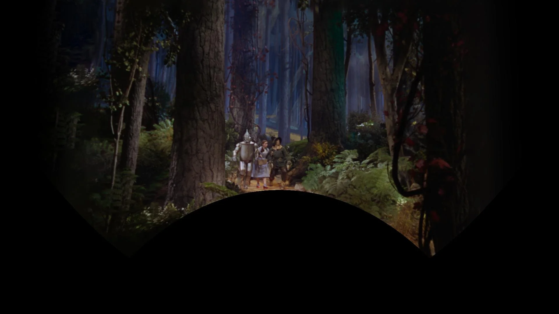
So, how do you color-grade a sphere? The short answer: you flatten it.
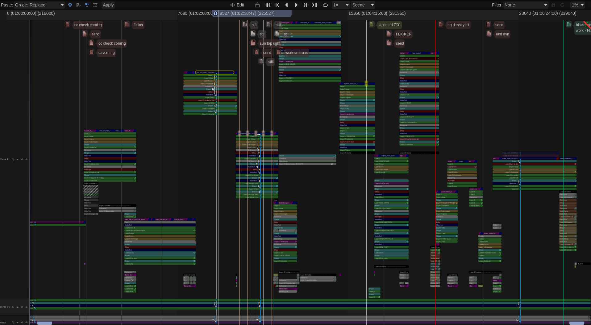
You could just put a spherical image in a timeline and start working, but instead we worked closely with FilmLight, who built custom tools specifically for this project. These new tools allowed us to work with the massive lat-long (equirectangular) images "flat" in the Baselight, removing the spherical distortion so we could see the picture clearly. This was a critical innovation, building on the smart panorama tools already in the software, and it made the entire process possible.
The Origin: A VR Sizzle Reel
This project didn't start in a 16,000-seat arena. It started over two and a half years ago as a proof of concept for a VR headset.
The initial goal was simple: create a sizzle reel to get executives on board and, more importantly, to test a core technical question: would the original film scans even hold up once they were stretched and placed into a 180-degree equirectangular format?
It was a long journey from that first VR test to the final show in Las Vegas, but seeing it all come together has been one of inexpressible highlights of my career. A huge congratulations to the entire team for pulling off this massive technical and artistic achievement.
A Big Day for "The Work We Do in the Dark": IMDb Launches the "Color Department"
It’s finally here.
After years of advocacy, IMDb and IMDbPro have officially launched a dedicated "Color Department" category. This is a monumental and long-overdue step forward for our craft.
For decades, the work of professional colorists, the artists who help shape the final look, mood, and emotional impact of a film has often been bundled under generic categories like "Additional Crew" or "Editorial Department." While we are proud collaborators with every department, this old system obscured the unique artistic and technical contributions that are core to our profession. It made it harder for audiences to find us, for producers to credit us properly, and for new talent to see a clear path.
When a change like this happens, it makes you reflect on your own body of work. I find myself thinking back to Contagion. This was back when the 'Intermediate' in Digital Intermediate really meant something. It was an intermediate step to a final film print.
We had all this text over picture that needed a very specific, saturated "warning / danger" red. It looked fantastic on the digital projector, but that red was completely out of gamut for celluloid; you just couldn't hit it on film. I'll always remember the challenge of working with my mentor and film timer, Dan Muscarella, tweaking the look-up tables to land on a red Steven was content with for the final prints. I say content, not happy or elated… content. Ahh, the good ole' days of the film lab.
That kind of problem-solving, that invisible craft, is at the heart of what we do. To know that this film, and all the unseen work that went into it, will now be correctly and clearly categorized under my primary profession with the rest of my team... that's what this is all about.
This is more than just a database update; it's about visibility and acknowledgement
To all my fellow colorists: log in to your IMDbPro account, update your page, and officially set your profession to "Color Department." Let’s make our new home visible.
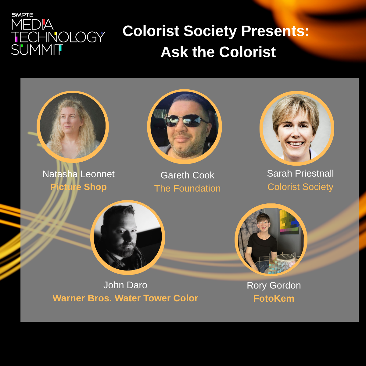
Thanks for joining the "Ask the Colorist" panel at SMPTE 2025!
What a lively and insightful afternoon we had at the SMPTE Media Technology Summit! A huge thank you to everyone who joined us at the Solutions Hub Stage to participate in the "Colorist Society Presents: Ask the Colorist" panel. It was a true pleasure to engage in such a thoughtful and forward-looking discussion with my fellow colorists and our enthusiastic audience. We had a lot of great questions asked.
A special shout-out to my esteemed co-panelists: Picture Shop's Natasha Leonnet, The Foundation's Gareth Cook, the Colorist Society's own Sarah Priestnall, and FotoKem's Rory Gordon. Your contributions were invaluable!
For those who couldn't make it, here are some of the deeper takeaways from our conversation.
Delving into machine vision's role
We went beyond a surface-level look at automation and explored the specific, powerful applications of machine vision in the color suite.
The conversation around shot matching was particularly rich. We touched on tools from Filmlight’s presentation, which leverage machine vision and perceptual models to quickly analyze a key shot and automatically match its "look" across an entire scene. This technology streamlines the technical heavy lifting, freeing the colorist to focus on artistic direction.
It's not just about matching. I've previously blogged about using machine vision to create a depth channel from existing footage. This allows for advanced atmospheric effects, like subtly desaturating the background to draw the viewer's eye to the foreground action.
We also addressed the technical hurdles. As machine vision relies on robust image data, we highlighted challenges related to lighting changes, calibration, and managing large datasets. This reinforced the need for a precise and consistent technical foundation. Perhaps even a standard for checkpoints from SMPTE in the future.
The backbone of consistency: The ACES workflow
Another key discussion centered on the Academy Color Encoding System (ACES), which was front and center in conversations about modern post-production.
We discussed how this device-independent color management system is no longer a niche tool but a foundational element, especially when dealing with multiple VFX houses and camera formats. ACES simplifies matching footage from different cameras by normalizing everything into a single common space.
In the age of HDR, we focused on how ACES provides a predictable and consistent image display across a wide range of devices. This is essential for preserving the creative intent throughout the entire pipeline, from on-set monitoring in virtual production to final delivery.
Balancing art and technology
Ultimately, the technology is only as good as the creative eye behind it. Taste was echo’ed many times by all panelists. Machine vision is a powerful assistant, but it doesn't replace the colorist. The consensus was that our role is shifting:
Instead of being overwhelmed by repetitive tasks, soon use machine vision to handle the initial technical correction.
This allows us to dedicate more creative energy to refining the mood, shaping the story, and making those nuanced, human-driven decisions that define a project's final look. More time grading and less time “correcting.”
The ongoing evolution of remote workflows. The discussion touched upon the lasting changes from the pandemic and how cloud-based grading is becoming more and more common. We talked about how to strike the right balance, manage latency issues, and ensure secure, high-quality collaboration when a client is not in the same room.
The importance of consistency over flashiness. A great reminder that long-term success in this field isn't about chasing one viral, incredible grade. It's about consistency, repeatability, and being a reliable, trusted partner within the post-production pipeline. We touched on the importance of checking your ego at the door and focusing on the client's needs.
Thank you again to SMPTE for organizing such an excellent event and to everyone who attended. It was a privilege to share insights and discuss the incredible future of our craft. I look forward to seeing you all again soon!
Join Me for the 'Ask the Colorist' Panel at the 2025 SMPTE Summit!
I'm thrilled to announce that I will be speaking on a panel at the upcoming SMPTE 2025 Media Technology Summit this month in Pasadena.
It's an honor to be part of the "Ask the Colorist" panel, presented by the Colorist Society. This will be one of the highlights of the summit, offering a chance to connect with peers and discuss the craft we're all so passionate about. I'm looking forward to a lively discussion and answering any and all of your questions.
I'll be joined on stage by an incredible group of esteemed professionals, including Natasha Leonnet (Picture Shop), Gareth Cook (The Foundation), Sarah Priestnall (Colorist Society), and Rory Gordon (FotoKem).
Event Details
What: "Ask the Colorist" Panel
Where: The Solutions Hub Stage at the SMPTE 2025 Media Technology Summit, Pasadena Convention Center (300 E Green St, Pasadena, CA)
When: Tuesday, October 14th, 2025, at 2:00 PM
The full summit runs from October 13-16 and is a must-attend event for anyone in media technology.
If you're attending SMPTE, please mark your calendar and come by the Solutions Hub Stage. I hope to see you there!
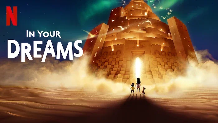
In Your Dreams | Official Trailer | Netflix
Here’s the new trailer for “In Your Dreams” Finished at Water Tower Color. Very excited for this one to be released in November!
The Wizard of Oz at Sphere
Absolutely honored to have contributed with the Water Tower Color team on "The Wizard of Oz" for the MSG Sphere. This project represents a paradigm shift in immersive entertainment.
A massive congratulations to the entire post-production team, the forward-thinking visionaries at MSG Sphere, and the brilliant minds at Google DeepMind who powered this spectacle. This was a monumental collaboration, and the result speaks for itself. We didn't just raise the bar; we created a new one.
Congratulations again to all involved. The future of immersive entertainment is bright, and I can't wait to see what we all create next.
Click through to YouTube to use your phones accelerometer to move the view around.
Here is the original proof of concept I made over two and half years ago. It was truly amazing to see how far it had come at the premier last night. Make sure to check it out next time you are in Vegas!
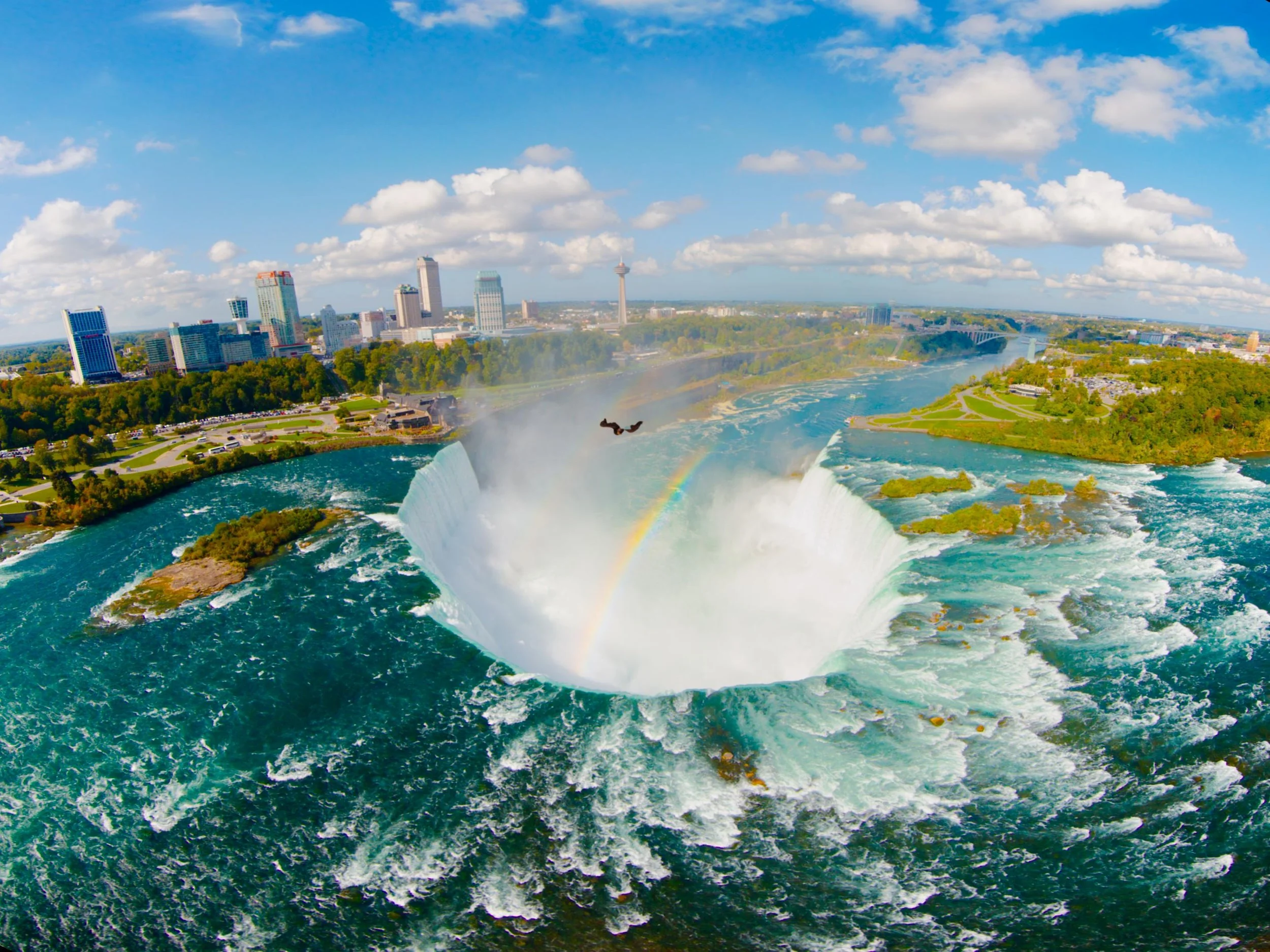
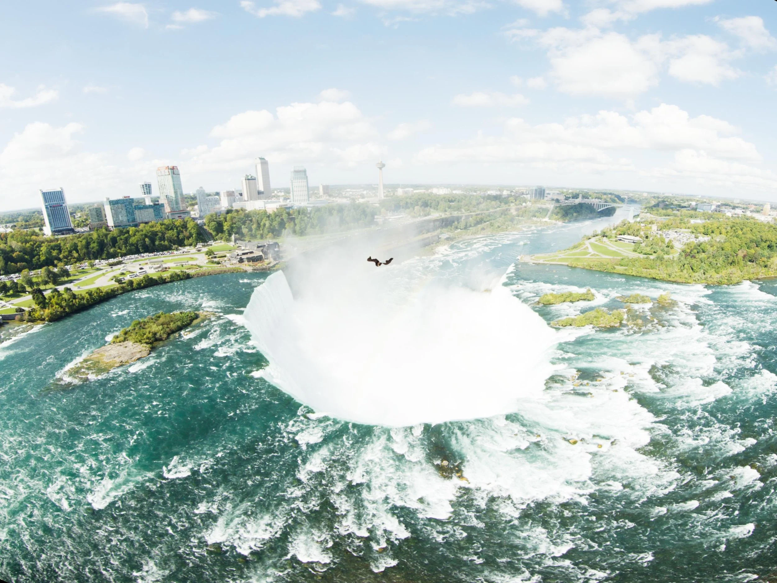
Niagara Takes Flight
Project: Niagara Takes Flight - An On-site Color Grading Adventure
Niagara Takes Flight opens today! Its a beautifully Immersive 4d adventure over Niagara Parks. I’m very greatfull that my long time collaborator Rick Rothschild tapped me again to make the images sing like the locations do in real life. Rick and I go all the way back to Soarin’ Over California when we first met. It’s honor to work with such a consummate professional and true leader and innovator in the space.
I've spent a lot of time in the controlled environment of the theater at Warner Bros. Water Tower Color, but sometimes a project comes along that requires you to get out in the field. This was one of those times. "Niagara Takes Flight" is an immersive ride experience that uses four laser projectors and a Seventh Sense system to warp and project the content onto a massive, curved dome.
There's just no substitute for being in the venue. The interaction between those four projectors presents a unique set of grading challenges that you simply can't solve in a standard grading suite. My goal was to create a seamless, powerful, and truly immersive experience for the audience. To do that I had to take Water Tower Color to Niagara.
The Powerhouse Duo
My portable setup was built around a MacBook Pro M3 Ultra and a 12TB IOdyne Pro Data drive, configured in RAID 0 for pure performance. The disk's speed and small footprint made all the difference; honestly, there's nothing else on the market that would have let me travel so light, and set up so fast.
My Peripherals
Control Surface: Tangent Elements. My first choice would have been a Slate, but the Elements' modularity made it perfect for packing.
I/O: A Blackmagic UltraStudio Mini 4K connected via Thunderbolt.
Storage: An IOdyne Pro Data 12TB array. Be sure to enable multipathing and connect the disk on two different busses, for example 1&3 not 1&2.
Misc: An Elgato Stream Deck for macros and a 4th gen iPad Pro used as a secondary display for scopes and stills via Sidecar.
Media and Timeline:
The footage was 60fps, 5760x4320 PIZ-compressed 16-bit half-float EXR files. I kept my Baselight project on the Mac's local database, but all the source media, caches, proxies, and renders lived on the Pro Data drive. The timeline was complex. We worked in a scene-referred grading space, which meant I wasn't doing any harm to the pixels, keeping the master as fluid as water until the final delivery targets were struck for the theater and frozen into ice, ACES archival elements, and other client versions were also rendered which insures longevity for any systems that may come along in the future.
Performance & Reliability:
Playback was a dream—60fps with no problem. I did have one render hiccup: the Mac went to sleep during a long render when it ran out of power even though it was connected to the Pro Data. The solution was simple— disconnect the panels and breakout box, since they're not needed for rendering and just plug in the power adapter in.
Shout Outs
Peter Postma and the Filmlight crew came through in a big way with early versions of Baselight M. It’s such a pleasure to have that kind of power in my backpack. Another huge thank you to Mike Gitig and the entire IOdyne team for thier support. I also want to thank NPC, Brogent, Rick Rothschild and Mike Quigley for allowing me to contribute my small part to this spectacular attraction. I have a feeling it will be there for many years to come so go check it out next time you are planning your family vacation! The falls are truly one of those bucket list places you must visit. Nothing else like it on the planet.
LG Roadshow - A New Era of Home Entertainment: Ambient Light Compensation
Here is a promo video I was recently a part of, showcasing a technology I'm incredibly passionate about: ambient light compensation at the LG Roadshow. If you've ever wondered how we ensure the picture you see at home matches what we see in the color grading suite, this is a big part of the answer. In a way, a little bit of my eye is in every display that has this technology.
A huge thank you to Mike Zink, Annie Chang, Mike Smith and the UHDA for their tireless efforts in bringing this functionality to living rooms everywhere.
And a friendly reminder: please use Filmmaker Mode. It should be the default, in my opinion. If you care about seeing a film as the artists intended, make sure to turn it on!
Check out the video below!
ACES at Cine Gear Saturday June 7th
Join me on the ACES panel "Color Management That Can Up Your Game!" at Cine Gear Expo! Saturday, June 7th, 1:15 PM - 2:05 PM, Theater 1. Looking forward to a great discussion with Lynette Duensing, Patrick Renner, and Mark Weingartner, ASC. See you there!
WB Tour Spot
Check out this spot Water Tower Color graded for WB Tours.
Until Dawn out today
It’s scarier in a theater! Go check it out
Bridging Eras: How AI is Reimagining 'The Wizard of Oz' for the Sphere
Hey everyone,
A recent project showcases a remarkable collaboration between Google AI, Sphere Entertainment, and our very own Warner Bros. to bring "The Wizard of Oz" to life like never before.
More to come soon. Check out the video below
Building a Retro CRT Effect: From Shadertoy to Baselight Matchbox Shader
Hey everyone, lately, I've been asked to dive back into the world of retro aesthetics, and one thing that always stands out is the look of old CRT (Cathode Ray Tube) monitors. That characteristic scanline flicker, the subtle noise, and the slight color fringing – it's all part of a nostalgic visual language. I wanted to bring that look into Baselight (last time I did this it was for Mistika. https://www.johndaro.com/blog/2020/10/28/vhs-shader), so I built a custom Matchbox shader that accurately simulates these CRT artifacts. This post breaks down the process, from finding inspiration to creating a user-friendly tool.
The Inspiration: Shadertoy
My journey started on Shadertoy, a fantastic resource for exploring and learning about GLSL shaders. I found a great CRT effect shader (https://www.shadertoy.com/view/Ms3XWH) that captured the essence of the look I was after. It used clever techniques to generate scanlines, add noise, and even simulate chromatic aberration (that slight color separation you see at the edges of objects on old TVs).
However, Shadertoy shaders are self-contained and designed for a specific environment. To make this useful in Baselight I needed to adapt it for the Matchbox framework.
From Shadertoy to GLSL Standard
The first step was to "translate" the Shadertoy-specific code into standard GLSL. This involved a few key changes:
mainImagetomain: Shadertoy uses a function signaturemainImage(out vec4 fragColor, in vec2 fragCoord). Standard GLSL, and Matchbox, usevoid main(void). We also replacefragCoordwith the built-ingl_FragCoordand output the color togl_FragColor.Uniform Inputs: Shadertoy provides inputs like
iResolution(screen resolution) andiChannel0(the input texture) automatically. In Matchbox, we need to explicitly declare these asuniformvariables:adsk_result_w,adsk_result_h, andsrc, respectively. We also addediTimeas a uniform to control animation.Texture Sampling: Shadertoy's
texturefunction becomes the standardtexture2Din GLSL.
Here's a snippet illustrating the change:
Shadertoy:
void mainImage( out vec4 fragColor, in vec2 fragCoord )
{
    vec2 uv = fragCoord.xy / iResolution.xy;
    // ...
    vec4 tex = texture(iChannel0, uv);
    fragColor = tex;
}
Standard GLSL (for Matchbox):
uniform float adsk_result_w;
uniform float adsk_result_h;
uniform sampler2D src;

void main (void)
{
    vec2 uv = gl_FragCoord.xy / vec2(adsk_result_w, adsk_result_h);
    // ...
    vec4 tex = texture2D(src, uv);
    gl_FragColor = tex;
}
Making it Controllable: Matchbox XML
The real power of Matchbox comes from its ability to expose shader parameters as user-adjustable controls. This is done through an XML file that describes the interface. I wanted to give users control over the key aspects of the CRT effect:
Scanline Width: How thick the scanlines appear.
Noise Quality: The granularity of the vertical noise (lower values create more distinct lines).
Noise Intensity: The amount of horizontal jitter.
Scanline Offset: The intensity of the vertical scanline displacement.
Chromatic Aberration: The strength of the color fringing.
Time: The speed of the animation.
To achieve this, I did the following:
GLSL Changes: In the GLSL code, I replaced the
const floatvariables that controlled these parameters withuniform floatvariables. This is crucial – it tells Matchbox that these values can be changed externally.
// Before (hardcoded):
const float range = 0.05;

// After (Matchbox controllable):
uniform float scanlineRange;
XML Creation: I created an XML file (with the same name as the GLSL file) that defines the controls. Each control is specified using a <Uniform> tag. The most important attribute is Name, which must match the corresponding uniform variable name in the GLSL code.
<Uniform Max="0.1" Min="0.0" Default="0.05" Inc="0.001" ... Name="scanlineRange">
</Uniform>
The XML also includes attributes like DisplayName (the label in the Baselight UI), Min, Max, Default, Tooltip, and layout information (Row, Col, Page). These define how the control appears and behaves in Baselight.
Putting it All Together
The final step was to place both the .glsl and .xml files in the usr/fl/shaders directory. Baselight automatically recognizes the shader and makes it available in the Matchbox node. Pro tip, my shaders directory is a link to a network location. This way all the Baselights can share the same shaders and it makes updating easier.
Now, when I add a Matchbox node and select the CRT effect, I get a set of sliders and controls that let me tweak the look in real-time. I can easily adjust the scanline thickness, add more or less noise, and dial in the perfect amount of retro goodness.
Download the Files
You can download the complete GLSL and XML files for this Matchbox shader here:
Conclusion
This project was a great upgrade to my GLSL knowledge, demonstrating how to take a cool shader effect from a platform like Shadertoy and adapt it into a practical, user-friendly tool for Baselight. The combination of GLSL's power, speed, and Matchbox's flexibility opens up a world of possibilities for creating custom effects that can be used through out the entire post pipeline. It might be old tech but still very useful today. I hope this breakdown inspires you to experiment with your own implementation. Let me know what you think, and feel free to share your own shader creations!
Color Timer Podcast
Color Grading Animation with Seasoned DI Colorist John Daro
Introducing Water Tower Color
Water Tower Color is Open
Section Meeting Tuesday, October 15 6 - 8:30 pm
Join us for an exclusive SMPTE event focused on the technology and best practices essential for achieving accurate color-critical calibration across diverse environments—from on-set production to post-production and final display.
Our presenters, David Abrams of Portrait Displays and Guillermo Keller of Colorimetry Research, will guide you through an in-depth exploration of the tools, techniques, and methodologies used to ensure precise color calibration.
• Guillermo Keller will provide an overview of measurement devices, highlighting the differences between colorimeters, spectroradiometers, and other instruments. He will explain how to select the appropriate tool for calibrating technologies such as LCD, OLED, and Laser-based displays.
• David Abrams, Senior Product Manager at Portrait Displays, will showcase the practical application of calibration software, focusing on Calman® calibration software, measurement devices, and pattern sources. You will gain valuable insights into display quantification, calibration, and validation workflows, with practical demonstrations covering a range of display types, including a DCI Digital Cinema Laser projector.
Attendees will have the opportunity to witness live demonstrations of various display technologies and participate in a raffle featuring three prizes provided by Portrait Displays, including Calman Ultimate, Calman Studio, and Virtual Forge.
6:00 PM Reception and Refreshments
7:00 PM Program
As always, SMPTE meetings are free and open to all, even non-members.
Sign up to be notified about future SMPTE Hollywood Events: https://go.smpte.org/subscribe
What: Mastering Color-Critical Calibration - Technology and Best Practices
Where: Academy of Motion Picture Arts & Sciences Linwood Dunn Theater
1313 Vine Street Los Angeles, CA 90028
When: Tuesday, October 15
Time: 6 - 8:30pm PDT
Best Practices - Remote Color Approvals on iPad Pro
Color Settings on iPad Pro
Introduction
In the realm of professional film and video production, maintaining color accuracy is paramount. The iPad Pro, with its exceptional display capabilities, has become a valuable tool for remote color approvals. However, to ensure optimal results, it's essential to configure your iPad Pro correctly. This guide consolidates information from various sources to provide comprehensive instructions for achieving color accuracy on your iPad Pro during remote sessions.
iPad Pro (5th Generation and Newer)
Display Settings
Reference Mode: Turn ON
This automatically sets optimal color settings and locks them
Exception: Disable for Dolby Vision content review
Additional Settings (Automatically Set by Reference Mode):
Brightness: True Tone OFF
Night Shift: OFF
Accessibility > Display & Text Size > Auto-Brightness: OFF
Fine-Tune Calibration:
Recommended if you have a measurement device (like a spectroradiometer)
Measure a 100-nit gray patch and use the values in the Fine Tune Calibration menu
Brightness
Reference Mode:
Brightness slider is disabled
HDR: Peak brightness at approx. 800 nits
SDR: Peak brightness at approx. 100 nits
Dolby Vision Content:
Disable Reference Mode
Set brightness slider to 38%
Ensure other settings match what Reference Mode would set
Colorist Calibration (if applicable):
Colorist compares iPad Pro to reference monitor to fine-tune brightness
Shortcuts App:
Can be used to:
Determine the current brightness percentage
Create Siri shortcuts to set specific brightness levels
iPad Pro (2nd to 4th Generation)
Display Settings
Appearance:
Dark Appearance: ON
Automatic Appearance: OFF
Other Settings:
True Tone: OFF
Night Shift: OFF
Accessibility > Display & Brightness > Auto-Brightness: OFF
Accessibility > Display & Text Size > Reduce White Point: OFF
Brightness
Colorist Calibration (Recommended):
Colorist compares iPad Pro to reference monitor to determine base brightness setting
General Recommendations (If colorist comparison isn't possible):
SDR: Brightness slider at 50%
HDR:
Dark room: Brightness slider at 50%
Bright room: Brightness slider at 100%
Additional Notes for ClearView (Applicable to All Generations)
Streaming Apps: Download the required Sohonet ClearView 'Flex' app beforehand
Session IDs: Obtain necessary session IDs or an invite from myself or Paul ahead of the session by email.
Remember that these are guidelines, and some adjustments might be needed based on specific project requirements or for newer iPad models.
Let me know if you have any other questions or need further assistance!
Happy Grading,
JD
HDR by Barco
BARCO, Deluxe Studios
(former Glen Glenn Sound building),
900 Seward St., Los Angeles, CA 90038Tuesday 6 August, 2024, 6:30-10:00PM PDT
Colorist Society Hollywood invites all Colorist Society Members to experience HDR by BARCO at BARCO’s HDR Theater.
HDR by BARCO’s team Joachim Zell (aka JZ), Iris Wu & Anders Ballestad will demonstrate HDR by BARCO at BARCO’s HDR Theater. Attending colorists will have an opportunity to use the technology. Beer, wine, water, and snacks provided.

